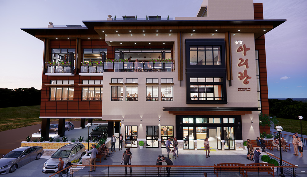
파사드_ 업무시설
2014. 10. 26. 22:10ㆍ00 JK 외 디자인/건물 (Buildings by Others)
Amano Design Office
The client is a developer company. It purchased a long-sought after lot in Ginza, and planned to build a commercial /office building. The building site is on the Ginza 1-chome Gaslight Street, which is one street behind the Ginza Central Street. It is on the back side of the Mizuho Bank and Pola Ginza buildings on the Central Street. The atmosphere is quite different from the gorgeous Central Street, and the site is on an empty street which is often seen behind the street with large-sized buildings. Attracting as many people as possible into such a street is our task. The client desired the building to be a gorgeous existence. In addition, the designer desired to provide a “slight feeling of strangeness” to the passersby that would attract them to the building.
Considering the views from the inside, simply obtaining openness with glass seems futile, since the outside scenery is hopeless. Therefore, a double skin structure is employed, which consists of glass curtain walls and graphically treated aluminum punched metal. The façade becomes a part of the interior decoration and obviates the need for window treatments such as blinds or curtains. By using a double skin, reduction of the air conditioning load and the glass cleaning burden was also intended.
The irregular façade design was determined by computing a design to avoid arbitrary forms and to approximate forms in nature. We thought that a well-made incidental form would likely be a less-disagreeable design. In the neighborhood of mostly modernist architecture with horizontal and vertical or geometric shapes, the building has a proper feeling of strangeness, attracts special attention, and has an appeal as a commercial building. The abstract flower graphic is used to balance the impression of the façade, i.e., to free it up from becoming too edgy.
By computing the design, individual aluminum punched panels are irregular with different angles and shapes, yet all fit into a standard size, resulting in excellent material yield. To avoid being clunky, an extremely lightweight structure is required. Therefore, much caution was taken in its details. The colored LED upper lighting, which is installed inside the double skin, entertains the passersby with different programs depending on the season. Expected tenants included a beauty salon and esthetic salon, and the expectations are materializing.
© nacasa & partners Inc.
Architects: amano design office
Location: Chuo, Tokyo, Japan
Collaborators: Atorie Oica , Azzurro Architects
Area: 155.55 sqm
Year: 2013
Photographs: nacasa & partners Inc.
'00 JK 외 디자인/건물 (Buildings by Others)' 카테고리의 다른 글
| 해안가 저택.... (0) | 2014.11.04 |
|---|---|
| 조그만 오두막집 리모델링_ 참 아담한 집이다....탐나네 (0) | 2014.11.02 |
| 업무시설 엿보기: White Wave (0) | 2014.10.25 |
| 빛과 침묵의 작은 채플(예배공간) (0) | 2014.10.17 |
| 자유언론 상징물 타워 by 구스타보 페냐 (Gustavo Penna' Shining Freedom of The Press Monument) (0) | 2014.10.17 |


